Primary & Middle School Mathematics · Grades 1–9
50Organizing Data
Before computing anything, data must be collected, counted and displayed. This chapter is about turning a messy list of observations into a clear table or picture: counts, frequencies, grouped data, bar charts and pie charts. Summarizing data by a single number (mean, median) is the subject of Chapter 71.
50.1 Counts and frequencies
Definition 50.1 (Count and frequency)
For each possible value of a survey, its count is the number of times it appears; its frequency is the count divided by the total number of observations:
Frequencies can be written as fractions, decimals or percentages, and they always add up to (i.e. ).
Example 50.2
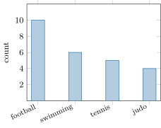
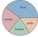
Favorite sport of the students of a class, from the raw list to the table:
| sport | football | swimming | tennis | judo | total |
|---|---|---|---|---|---|
| count | |||||
| frequency |
For football: . The frequency row must sum to — a permanent, free check.
Remark 50.3 (Why frequencies?)
Counts cannot be compared across groups of different sizes: football fans in a class of (that is ) show more enthusiasm than in a school year of (). Frequencies put everything on the same scale.
50.2 Grouping data in classes
Example 50.4 (Classes)
The heights (in cm) of students range from to . Listing every height separately would give a table with almost as many columns as students; instead, group into classes:
| height (cm) | total | |||
|---|---|---|---|---|
| count | ||||
| frequency |
Each height is counted in exactly one class ( goes in , not in both — that is why the intervals are half-open). Grouping loses detail but gains readability.
50.3 Charts
Method 50.5 (Choosing and drawing a chart)
- Bar chart: one bar per value or class, height proportional to the count (or the frequency). Good for comparing values.
Pie chart: one sector per value, angle proportional to the frequency — the full circle () represents the total, so
Good for showing shares of a whole.
- In both cases: title, labels, and a graduation or the percentages written on the chart.
Example 50.6
Angles for the sports of Example 50.2: football ; swimming ; tennis ; judo . Check: .
Example 50.7 (Reading critically)
A chart whose vertical axis starts at instead of makes a bar of look ten times taller than a bar of — visually misleading, although the numbers are honest. First reflex in front of any chart: check where the axis starts and what one graduation is worth (Method 44.8).
50.4 Exercises
Exercise 50.1 ★
Here are the marks of students: , , , , , , , , , , , , , , , , , , , . Build the table of counts (one column per mark).
Solution
Solution of Exercise 50.1.
Counting each mark:
| mark | total | |||||
|---|---|---|---|---|---|---|
| count |
Exercise 50.2 ★
Complete the table of Exercise 50.1 with a frequency row (as fractions of , then as percentages). Check the sum.
Exercise 50.3 ★
In a survey of families, have one car. What is the frequency of “one car”, as a decimal and as a percentage? In another survey, families out of have one car: which survey shows the higher proportion?
Solution
Solution of Exercise 50.3.
First survey: . Second: . The first survey shows the higher proportion, although it has fewer families with one car in absolute count.
Exercise 50.4 ★
The masses (kg) of dogs: , , , , , , , , , , , , , , . Group them into the classes , , , and give the counts.
Solution
Solution of Exercise 50.4.
: — count . : — count . : — count . : — count . Total . ✓
Exercise 50.5 ★
Draw the bar chart of the table:
| pets | ||||
|---|---|---|---|---|
| families |
Solution
Solution of Exercise 50.5.
Four bars of heights , , , over the values , , , (graduation every works well).
Exercise 50.6 ★
For the table of Exercise 50.5, compute the frequencies and the pie-chart angles of each value (check: total ).
Exercise 50.7 ★
A pie chart about favorite seasons shows: summer , spring , autumn , winter . What percentage chose each season? If people answered, how many chose summer?
Solution
Solution of Exercise 50.7.
Percentages: summer ; spring ; autumn and winter each. Out of people, summer was chosen by of them.
Exercise 50.8 ★★
In class A, students out of walk to school; in class B, out of . Which class has the higher proportion of walkers? Justify with frequencies, not counts.
Solution
Solution of Exercise 50.8.
Class A: . Class B: . Class A has the higher proportion of walkers, even though class B has more walkers in count.
Exercise 50.9 ★★
A magazine prints a bar chart of monthly sales: , then , then , with the vertical axis starting at . Describe what the reader sees, and what an honest axis starting at would show instead.
Solution
Solution of Exercise 50.9.
With the axis starting at , the three bars have visible heights , and units: the last looks four times the first, suggesting sales quadrupled. With an axis from , the bars are nearly equal ( to is a rise of about ): the honest picture shows almost flat sales.
Exercise 50.10 ★★
A frequency table has three values with frequencies , and . Find . If the total count is , give the three counts.
Solution
Solution of Exercise 50.10.
Frequencies sum to : . Counts (total ): ; ; . Check: .
Exercise 50.11 ★★★
In a school, of the students are girls. Among the girls, eat at the cafeteria; among the boys, do. Out of students, how many eat at the cafeteria? (Compute the four group sizes step by step.) What overall percentage is that?
Solution
Solution of Exercise 50.11.
Girls: of ; boys: . Cafeteria-going girls: ; boys: . Total: students, i.e. of the school — between and , closer to the girls’ rate because girls are more numerous.
50.5 Problem: How data lies — and how to catch it
Problem 50.1
Weekend problem — counts against frequencies, the poll that fooled a country, and the paradox of the two hospitals
Numbers do not lie, but they can be made to mislead: a huge count can hide a small frequency, a gigantic survey can be worthless, and — strangest of all — a hospital can beat its rival on every category of patients and still lose on the overall figures. All three traps are sprung in this problem, armed only with the counts and frequencies of this chapter (Definition 50.1).
Part I — Counts are not frequencies.
- School A recycles of its juice cartons; school B, of its . Which school has the larger count of recycled cartons? The larger frequency? Which school deserves the recycling prize?
- A new timetable is surveyed: of the teachers like it, and of the students do. Compute the two frequencies, then the frequency among all people together. Why does the combined figure sit so close to the students’ one?
- A published pie chart shows sectors labelled , , and . Without any further information, how do you know a mistake was made?
- A frequency table over observations is half-erased: counts , , , and frequencies , , , . Rebuild the missing entries.
- A survey ends with frequencies , and . Compute the three pie-chart angles (Method 50.5) and check they close the circle.
Part II — The poll that fooled a country. In 1936, an American magazine mailed ten million ballots to addresses taken from telephone directories and car registration lists, received million answers, and predicted a crushing victory for candidate Landon. A young statistician, George Gallup, questioned only about fifty thousand people — chosen to resemble the whole population — and predicted the opposite. Roosevelt won by a landslide.
- What frequency of the mailed ballots came back?
- In 1936 telephones and cars were luxuries. Explain in one or two sentences why the magazine’s sample, though enormous, was doomed — and which lesson of question 1 it repeats at national scale.
- A toy model. A town has wealthy voters, of whom support L, and modest voters, of whom support L. Compute L’s true support in the town. A “telephone-book poll” reaches wealthy and modest voters: what support does it predict?
- The silent trap: a company has unhappy customers and happy ones. It surveys everyone; of the unhappy reply, but only of the happy do. Compute the number of replies of each kind, and the frequency of unhappiness among the replies. Compare with the true frequency.
- Repair the poll of question 8: keep interviews, but distribute them in the town’s true proportions. What does the repaired poll predict?
Part III — The paradox of the two hospitals. Two hospitals publish their cure counts, split by severity:
| mild cases | severe cases | |
|---|---|---|
| hospital A | cured of | cured of |
| hospital B | cured of | cured of |
- Compute hospital A’s cure frequency for mild cases, for severe cases, and overall (all patients).
- Same three computations for hospital B. Which hospital wins on mild cases? On severe cases?
- Compare the two overall frequencies. State plainly the strange thing that has happened.
- Explain the trick: compare the two hospitals’ mixes of patients, and say why the overall frequency can betray both category frequencies. If you had a severe case, which hospital should you choose?
- A newspaper headline reads: “Hospital B has the better cure rate: against .” Write the two-sentence letter to the editor that this whole problem has taught you to write — one sentence on what the headline ignores, one on the general moral (compare like with like, and mind the weights).
Solution
Solution of Problem 50.1.
1. Counts: , school A wins. Frequencies: against : school B wins. The prize should follow the frequency — school B recycles a larger share of what it uses; school A merely drinks more juice.
2. Teachers: . Students: . Together: . The students are twenty times more numerous, so the combined frequency is pulled almost entirely to their side — the big group carries the big weight.
3. Frequencies must add up to (Definition 50.1), but : at least one sector is wrong.
4. Count for frequency : . The counts so far: , so the last count is , with frequency . (Check: .)
5. Angles: , , ; and : the pie closes.
6. of the ballots came back.
7. Telephone directories and car registries listed mostly wealthy households, whose vote differed from the country’s; the million answers were a giant count drawn from the wrong population. As in question 1: what matters is not how many you count, but whom — a frequency computed on a distorted sample describes the sample, not the country.
8. True support: supporters out of : . The poll: out of : — sixteen points too high, because the wealthy are half the sample but a tenth of the town.
9. Replies: unhappy and happy, so replies of which unhappy: measured unhappiness . True unhappiness: . Nobody lied — the unhappy simply reply more, and the survey hears them louder.
10. True proportions: one tenth wealthy, so wealthy and modest interviews: out of : the repaired poll predicts — the truth of question 8. Fifty thousand well-chosen interviews beat two million badly chosen ones.
11. Hospital A: mild ; severe ; overall .
12. Hospital B: mild ; severe ; overall . Hospital A wins on mild cases () and on severe cases ().
13. Overall, B shows against A’s : the hospital that loses in every category wins the total. (This reversal has a name: Simpson’s paradox.)
14. The mixes are opposite: A’s patients are mostly severe ( of ), B’s mostly mild ( of ). Severe cases cure less often wherever they are treated, so A’s overall figure is dragged down by the hard cases it accepts — the overall is a weighted blend, and the weights differ between hospitals. A severe patient should choose hospital A: beats in the only row that concerns them.
15. For instance: “Your comparison blends mild and severe patients, and the two hospitals treat opposite mixes — split by severity, hospital A cures a higher share of both kinds. Overall figures may only be compared when the groups behind them are alike; otherwise the weights, not the quality, decide the winner.”